Thali
Content Aggregation for Curious South Asians
A new mobile app concept delivering customised content from the South Asian diaspora, to the diaspora
Brief
Young South Asians lack representation in the mainstream media and struggle to find content relevant to them. Research, wireframe and prototype a digital solution, and present your outcome in a pitch deck aimed at an 'investor'.
Key Skills
Storytelling
UI Design
User Research
Component Building
Branding
UI Design
User Research
Component Building
Branding
Watch the video:
As a brown girl growing up in the western world I never saw myself reflected within mainstream content, whether it be Instagram or the Disney Channel. I had no inlet for questions I couldn't ask my family about, and often felt misrepresented - after all the Indian kid is always the "geeky kid with the accent" right? Though social media and western entertainment have made strides towards inclusion, we still have a long way to go.
Thali is the ultimate digital aggregator for the young, confused and underrepresented South Asian diaspora. Thali rounds up content from all over the internet that is tailored to the users' unique backgrounds. Thali is a place for young South Asians to feel like they belong and to stay informed through content from a South Asian lens - whether it's important news, or a laughable meme.
Research and Ideation
I delved into various online resources to assess current South Asian content coverage and identify where the gaps lie. What I found was that whilst there are a plethora of South Asian content creators, algorithms and 'white-washing' often means these stories don't sit 'above-the-fold'.
I considered making my outcome a "content aggregator". The app didn't need to be another article-churning outlet lost in the background when there were already so many others. It could be the "brown Google" shining a light on those who were quietly exercising their voices, yearning for recognition, to be seen and to be heard.
Interactive User Concept Labs
Before designing any screens or brand assets I ran interactive interviews with two people who fit my target audience. The participants engaged in a range of activities which allowed me to gather information about their tastes, visual preferences and behavioural habits.
Comparing the results from the activities helped me to find the common likes / dislikes across my target user base. This helped me establish the tone of voice, branding and visual identity for Thali.
Why the name 'Thali?'
Based on the lab results, I formulated a name and tone of voice for 'Thali'. A thali is an indian dish, served as a large platter with a mix of food in small steel bowls ranging from rice, to daals and more; It's the original aggregator. It's from this, the app structure was born. Just like a traditional thali, the app would mix together content from all over the internet - tailor made for the user.
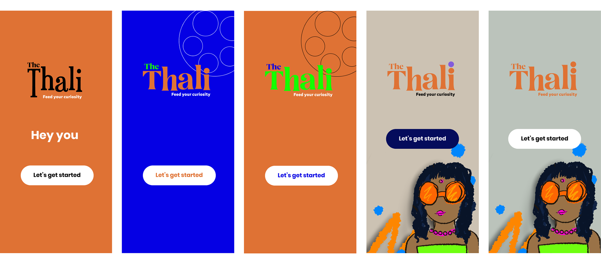
The branding had to be young, quirky, it had to sound like 'Thali' was your best friend, who always has your back. Copy such as "Not your uncle's WhatsApp forwards" was the most popular with the lab participants. I created mood illustrations, playing with bright colours and other copywriting slogans. I then tested the colours in sample landing screens before settling on the final brand colours, words and hierarchy.

Wireframing
Before applying the branding to the screens I set out to create the information architecture and general user journey map. I researched various competitor aggregators such as Google News and Flipboard as well as onboarding processes - a favourite being Slack's.
Following this I began wireframing. I started on paper, exploring onboarding and content hierarchy:
Moving from paper into Figma, I was able to apply a grid system, fonts and further build out the skeleton of the app. Below are a handful of screens from the wire-framing project file.
Component Building and Content Cards
I quickly realised that with a content aggregation app it was important to have the correct content cards built out as a component for uniformity and efficiency. I spent time experimenting with layouts for various content cards ranging from articles, to memes to audio after settling. Other component sets built out included selectors, custom icon sets and navigations.
Samples of iterations for the 'audio' card module
Final responsive components built in Figma for ease of build
A demonstration of the various ways in which 'Thali''s bespoke content cards can be used
Final outcome - The Pitch Deck
After applying the branding to the screens the entire project came together. I created many more screens than I ever intended to, having a great deal of fun with the onboarding especially. The final concept screens were presented in the 27-page pitch deck which you can explore below.
Click on the cover slide below and use the arrow keys to navigate through the pitch deck:
Results and Learnings
In 2023, Thali was awarded the SDCA Innovation Award for the project by Johnson & Johnson.
Being so close to home, Thali was a challenging project to undertake. I had to stay objective and not let my own opinions cloud my decisions. The overwhelmingly positive response for Thali has been incredible. After sharing the project, so many friends (and strangers!) have responded with comments like "When are you going to make Thali real?", or "I wish I had this growing up", which confirms I have targeted the outcome correctly. You can find my key learning points below:
