Bubble by Barclays
Combatting ADHD-Related Impulse Spending
A supplementary mobile app which uses activities and interventions to mitigate impulsive spending habits.
Brief
Create a digital solution that makes money management easier for Barclays' neurodivergent customers. Showcase your idea and prototype in a 2 minute video.
Key Skills
User Testing
Figma, UI / UX Design
User Research
Adobe AE, Motion Design
Figma, UI / UX Design
User Research
Adobe AE, Motion Design

Project Overview
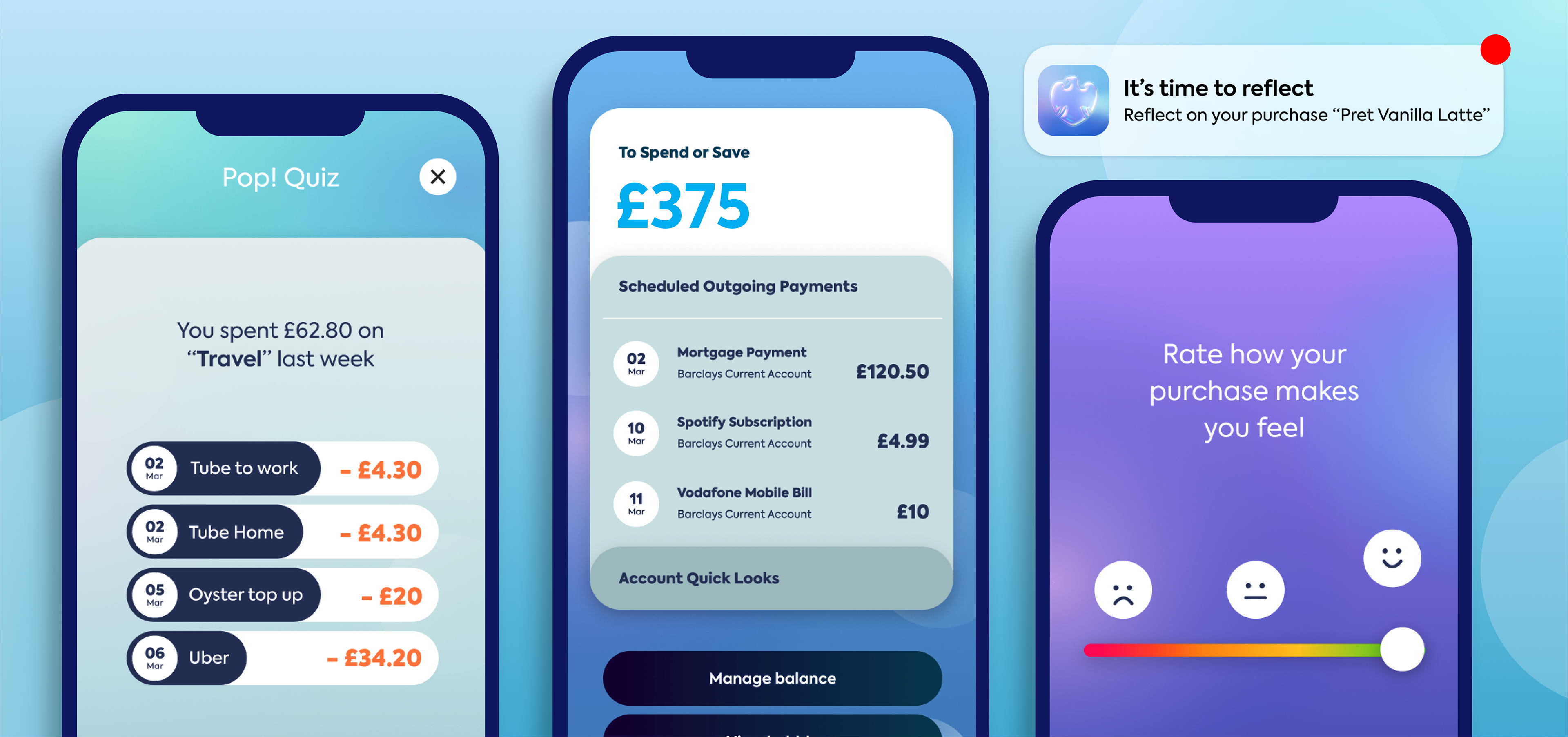
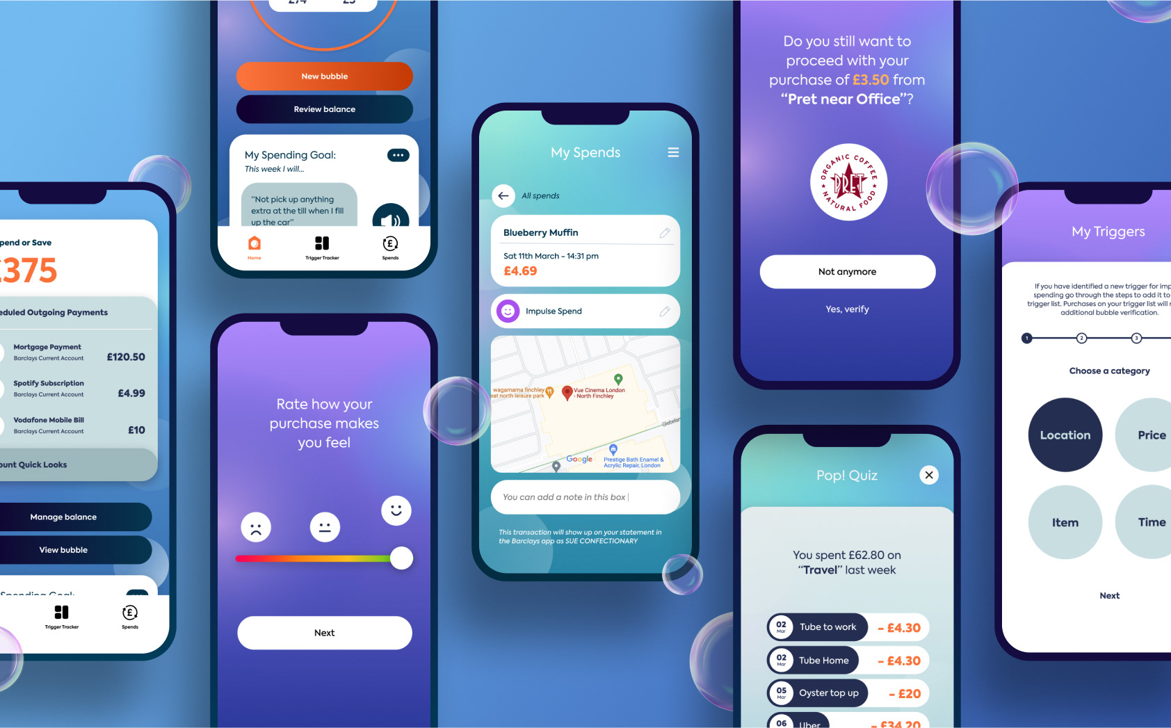
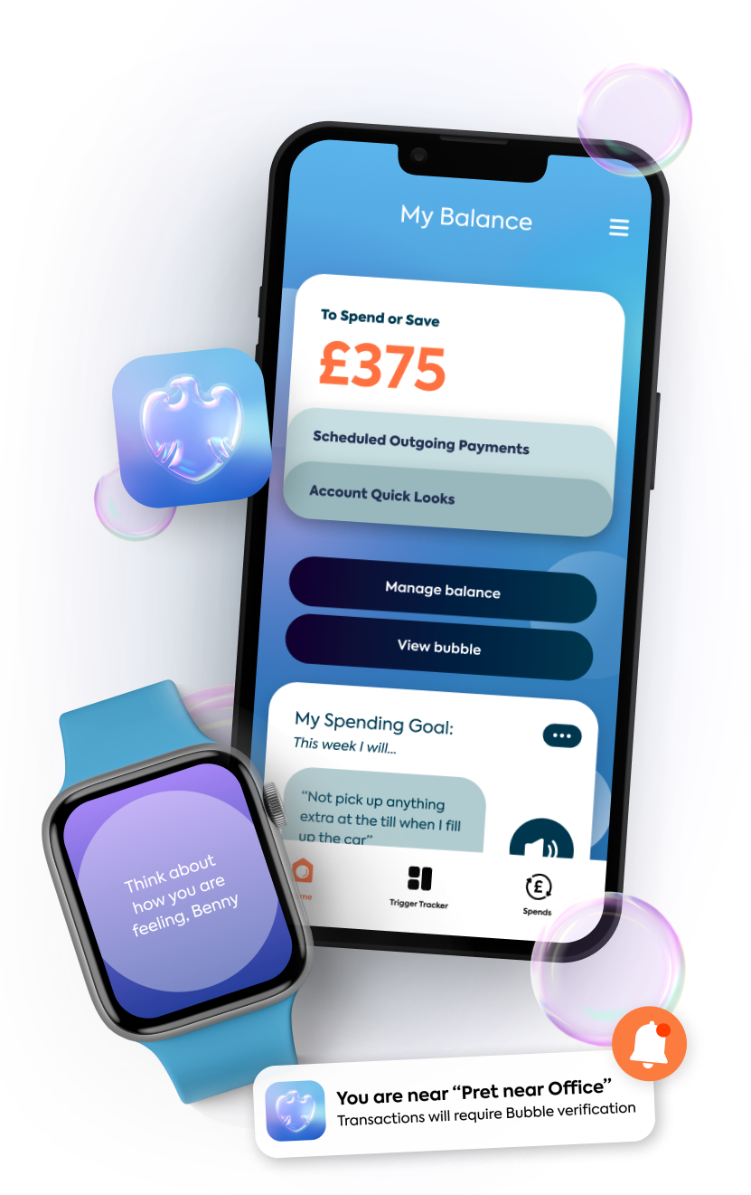
'bubble' helps customers with ADHD recognise, track and reflect on their impulsive spending habits whilst encouraging mindful spending. Small money-centric interventions provide ‘dopamine’ alternatives to curb impulsivity. ‘bubble’ allows users to visualise and portion their money, encouraging the view that your money can empower you to be free, whilst remaining something that should be handled with care - just like a bubble.
Watch the video:
Problem Space - What is the issue?
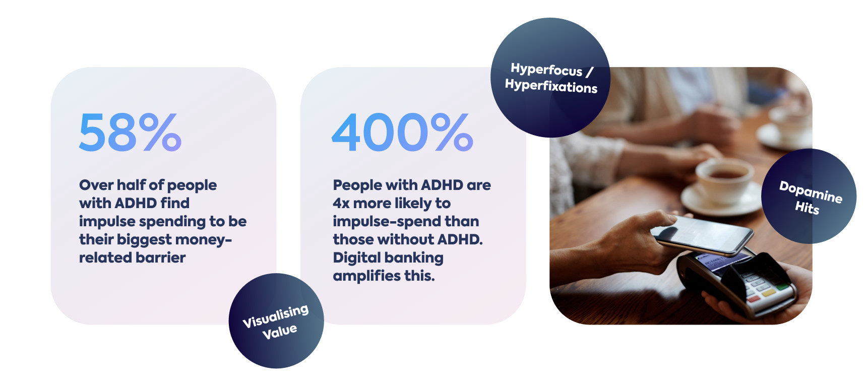
Impulsive spending is triggered by the ADHD tendency to ‘hyperfocus’ or ‘hyperfixate’ on specific thoughts or hobbies. Acting on these fixations sends a dopamine hit to the brain which is often satisfying in the moment but regretful upon reflection. As a result, many people with ADHD feel they lack control over their financial habits.
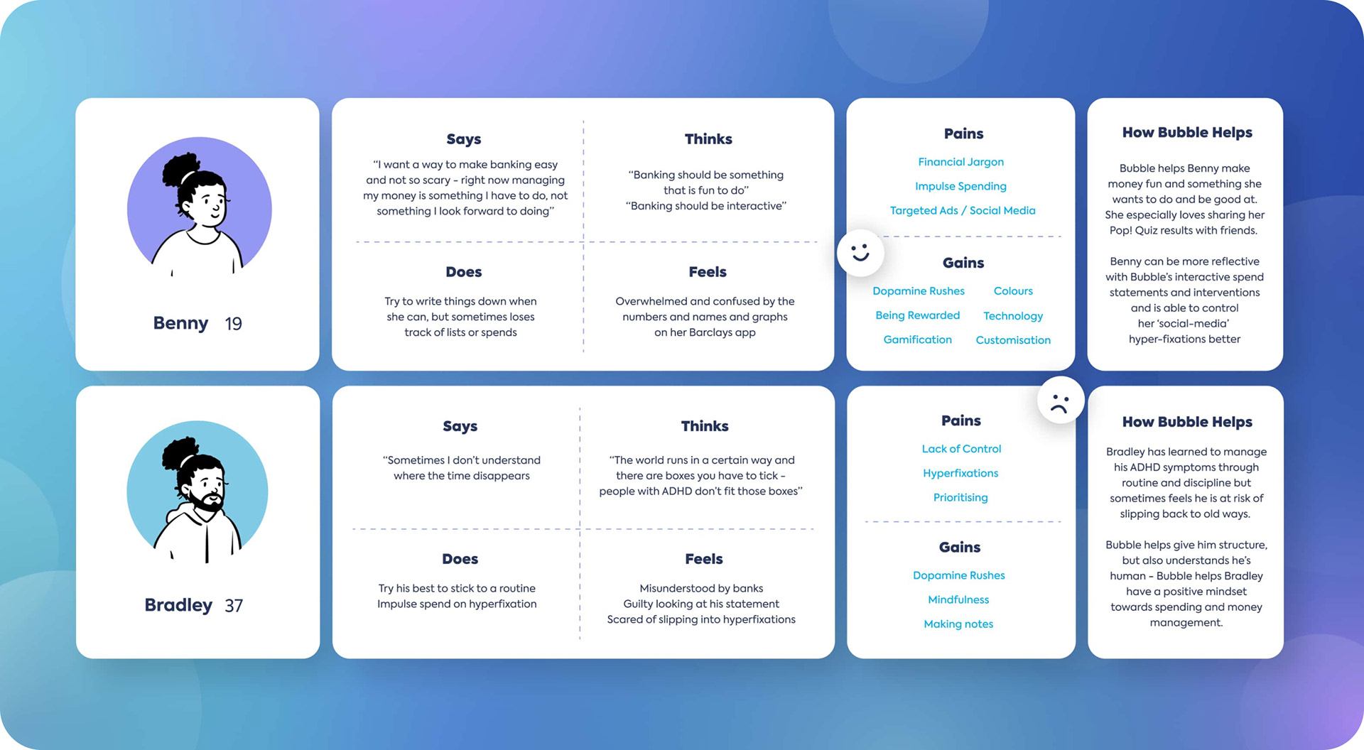
Who are the users?
Though 'bubble' can be utilised by any Barclays customer, it is specifically targeted at the needs of users with ADHD who have tendencies to impulse spend.
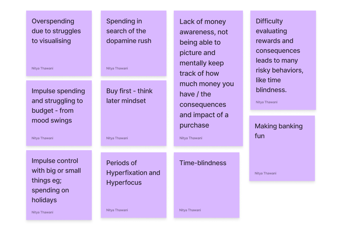
The insights and empathy maps below are findings from self-conducted user interviews with neurodivergent individuals ranging from ages 19 - 56 years old.
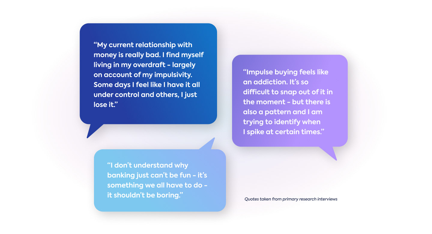
80% of the time spent on this project was spent gathering insight into the problems and existing solutions. Not having ADHD myself, it was important to me to develop a deep understanding of the current pain points my target users face with existing products. What is the source of the issue? What specifically makes money-management hard? I exhausted online resources and spoke to 15 people to pinpoint the issue and problem-solve.
Research methods included: user concept testing, interviews, chat forums and interactive labs.
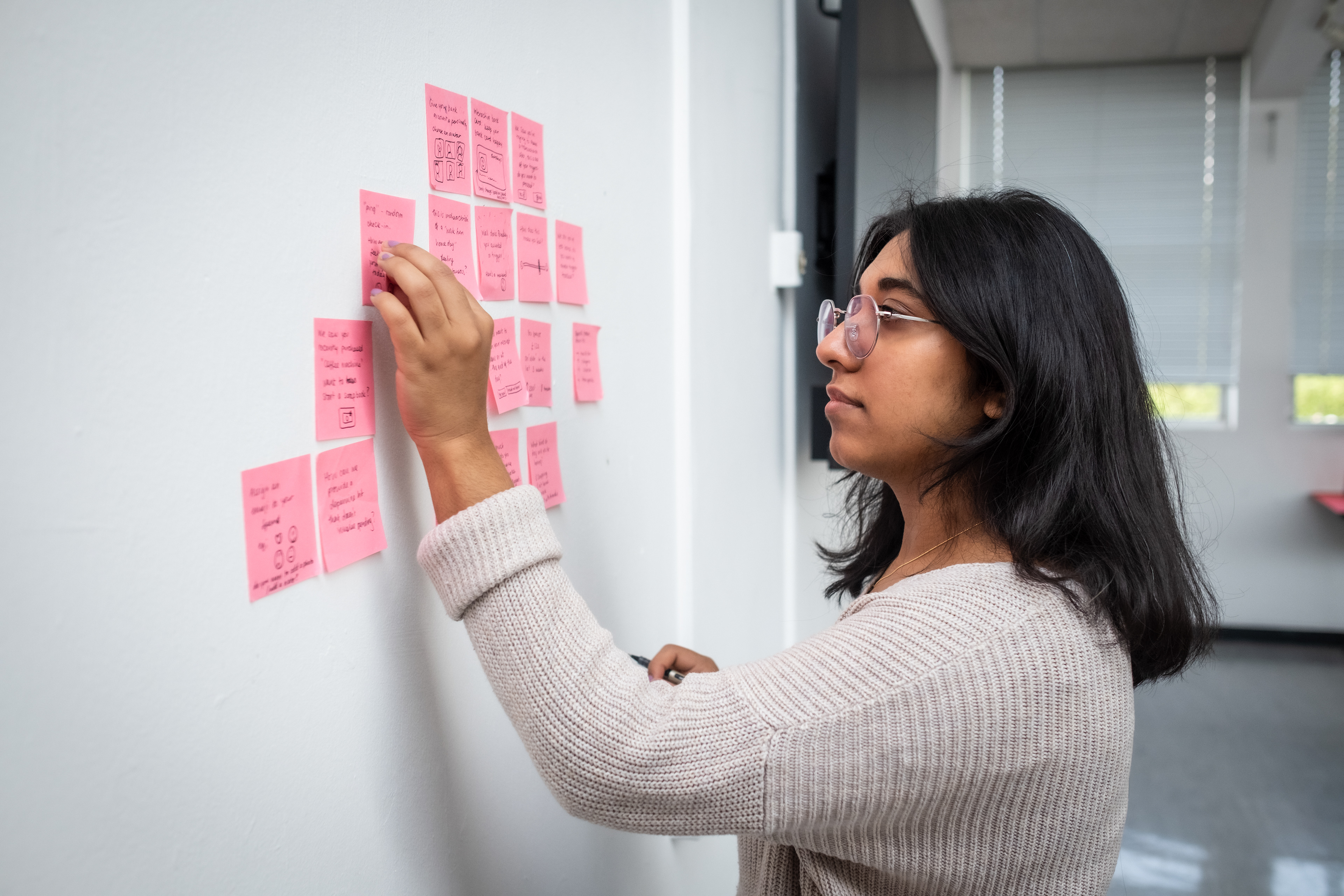
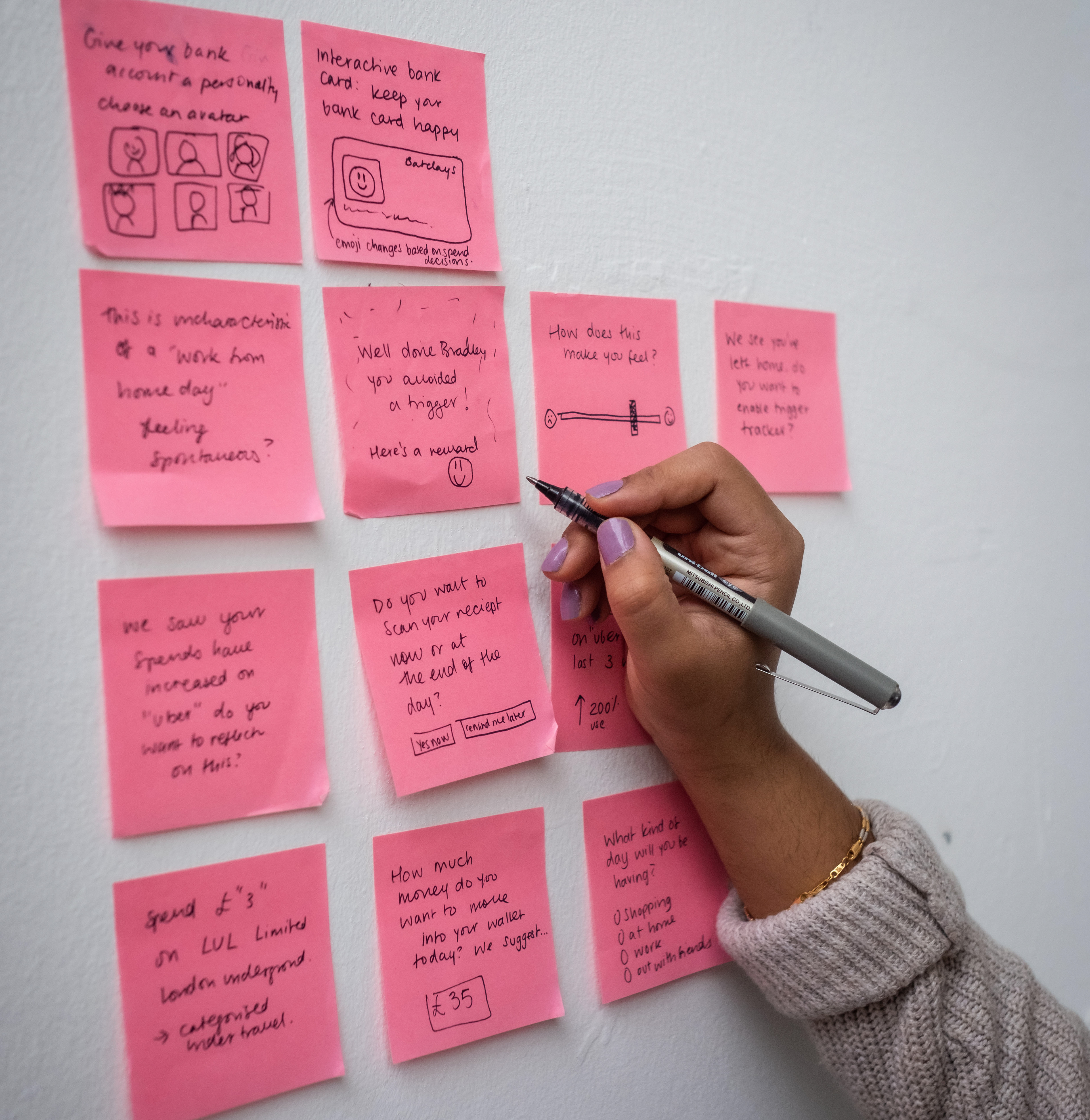
Walls and post-it notes! A feature-mapping exercise which helped me prioritise and test potential features with users.
User Interviews in Figma
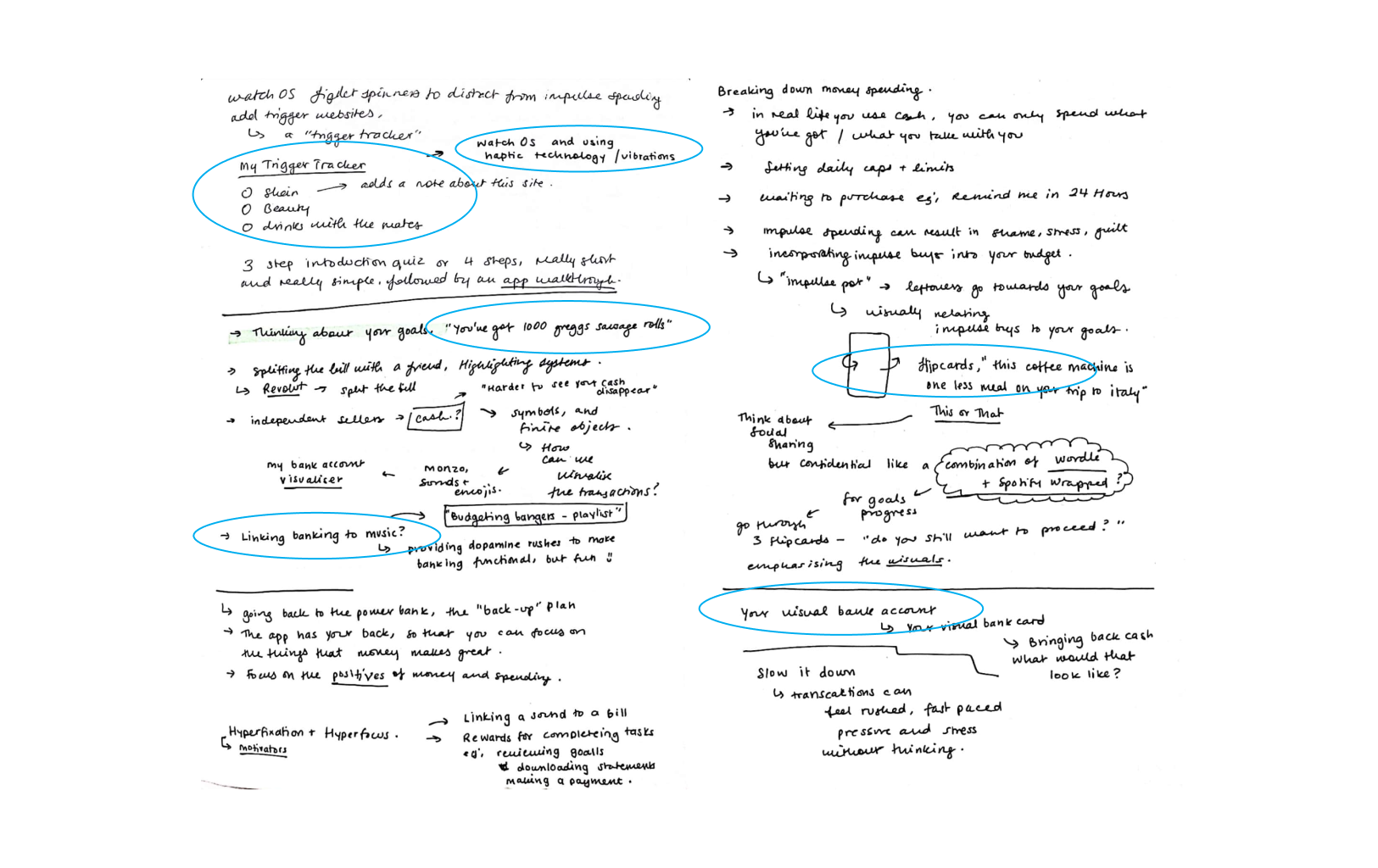
Conducting interviews helped me identify and cross-reference the common issues as well as begin to define an approach to the solution. I would make extensive notes and then highlight and categorise the content I felt was key, later sorting these into post-its to consolidate my findings.
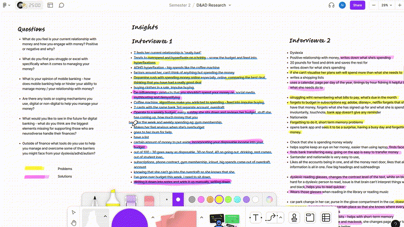
Often I would organise research findings in Figma and then brainstorm and ideate on paper:
Key findings and focus areas
Cross-referencing findings allowed me to focus on a few shared issues that I could approach strategically. These include...
Both real and digital post-its helped me sort through insights efficiently. Above are the problems I aimed to solve with 'bubble'. Below are early solution prompts used in a card-sorting exercise.
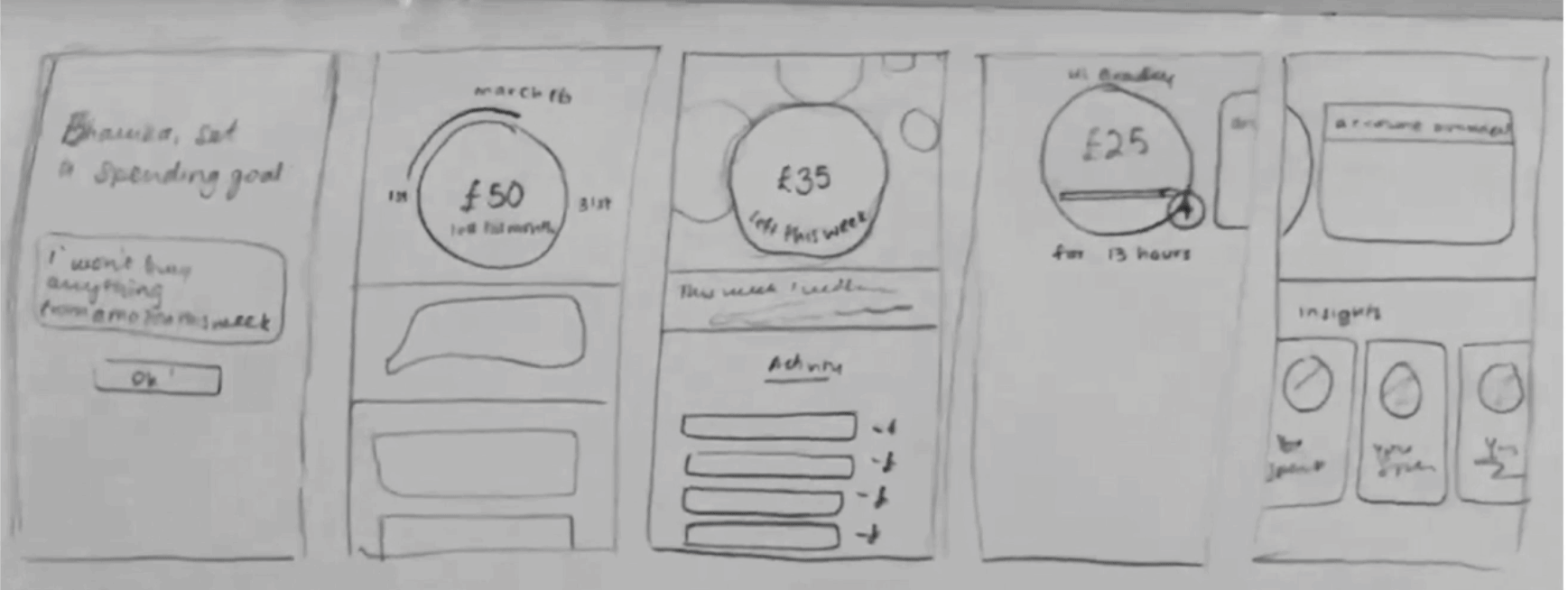
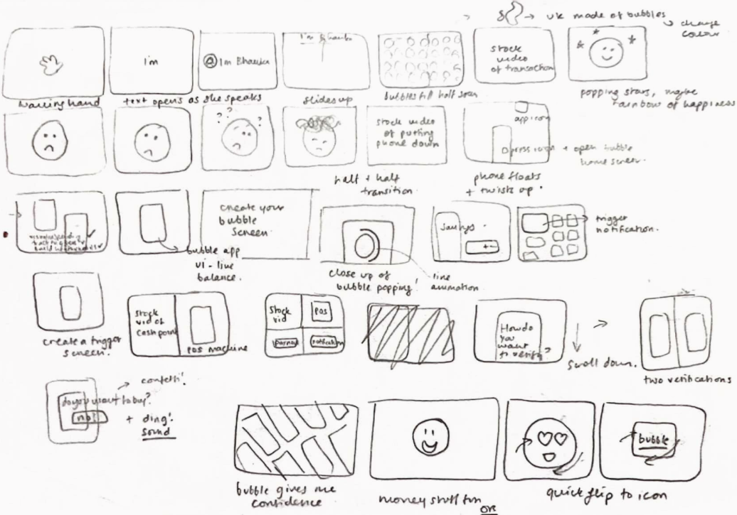
Wireframing solutions
After feature-mapping and concept testing with target users came the design phase. Bubble had a framework, it was time to translate the concepts into the UI. I always start off on paper with a loose structure and then build out from there in Figma as demonstrated below:
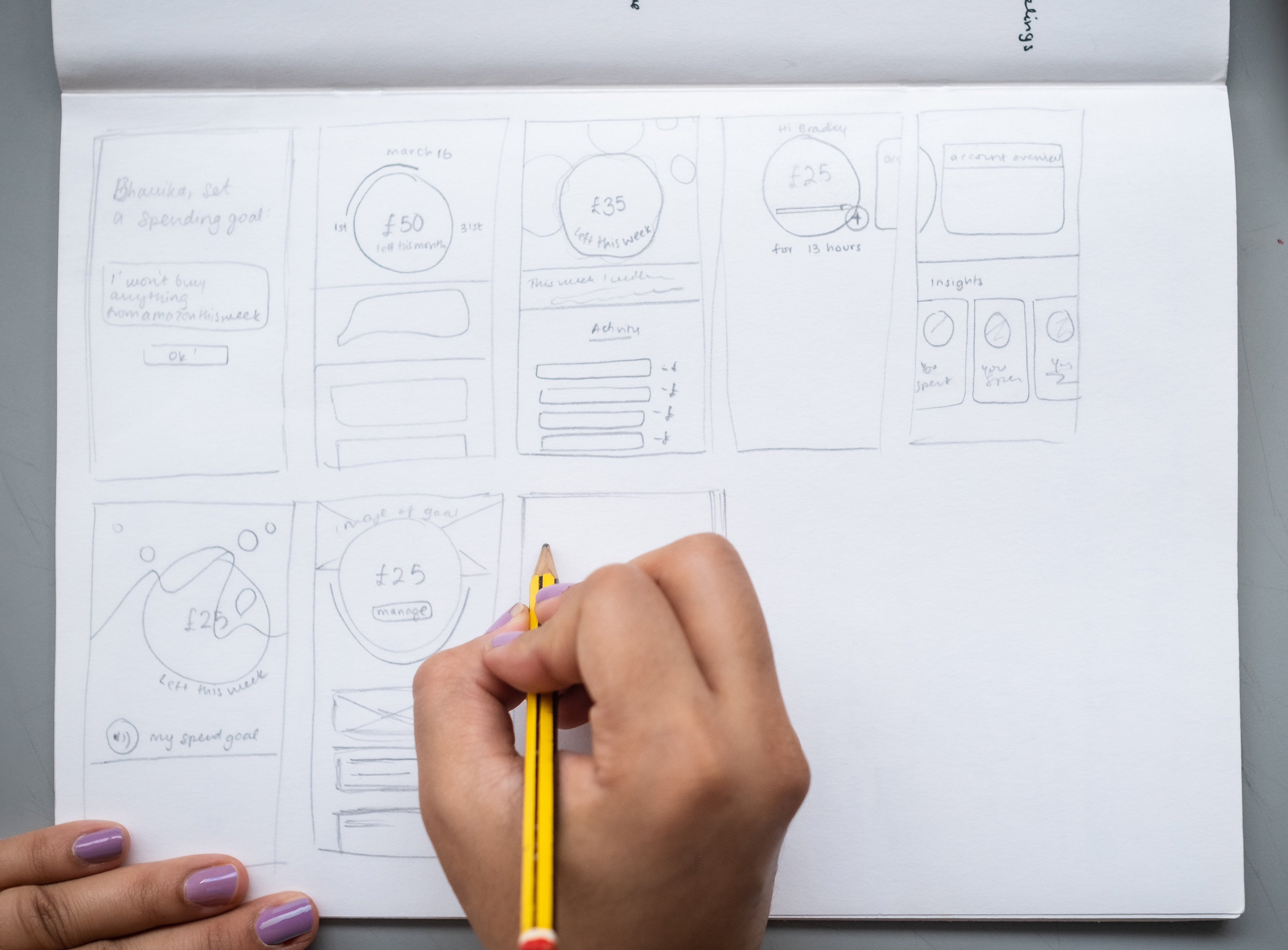
I loved iterating with the screen layout and narrowing down the designs that worked best based on my user research. The circular-focused approach was strongly favoured with users as it spotlighted the budget and information clearly whilst also tangibly representing the fragility of the financial 'bubble'.
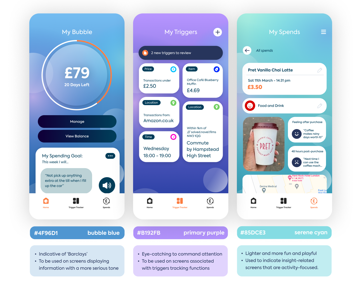
Applying insights to hi-fidelity
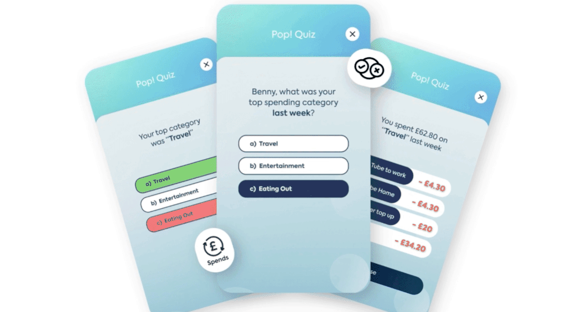
One of the most prominent insights about popular finance-related apps were that the interfaces were not engaging, especially to those with ADHD who seek dopamine-inducing playful colours.
Whilst testing the hi-fidelity mockups, users loved the idea of segregating content with "fun colours". I applied the following 3 colour schemes to segregate the 3 key feature areas of the app: Home, Trigger Tracker and Spends.
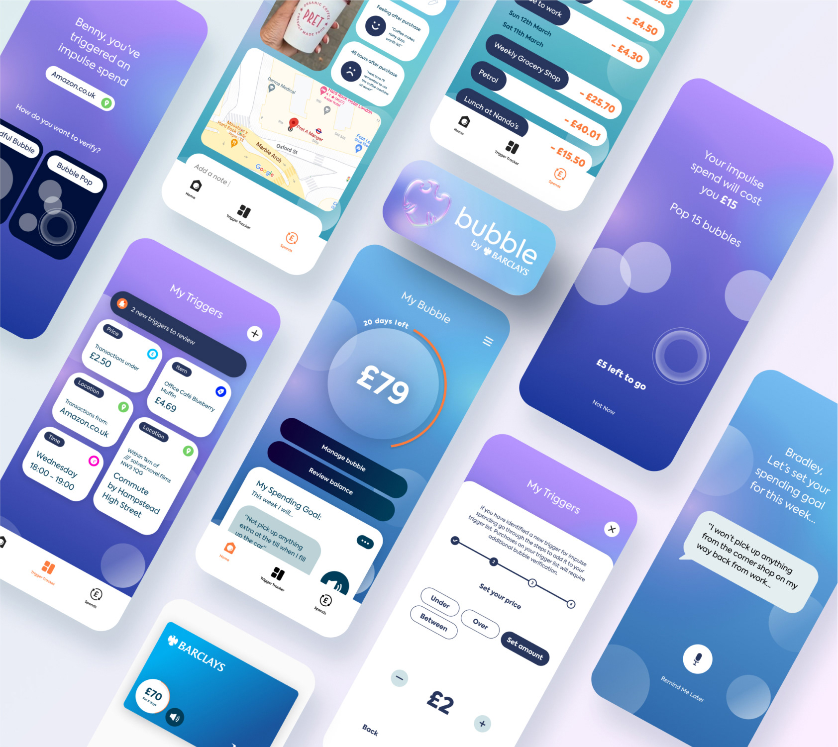
After finalising the hi-fidelity screens, I moved on to the planning, thumbnailing script-writing for the pitch video. The video was the primary outcome of the project. Planning helped me prioritise which user-flows needed to be prototyped and demonstrated to best highlight the app features.
To animate, I used a mix of After Effects and Figma prototyping tools:
Storyboarding helped me visualise my video in alignment with my script. This helped me stay within the 2-minute mark.
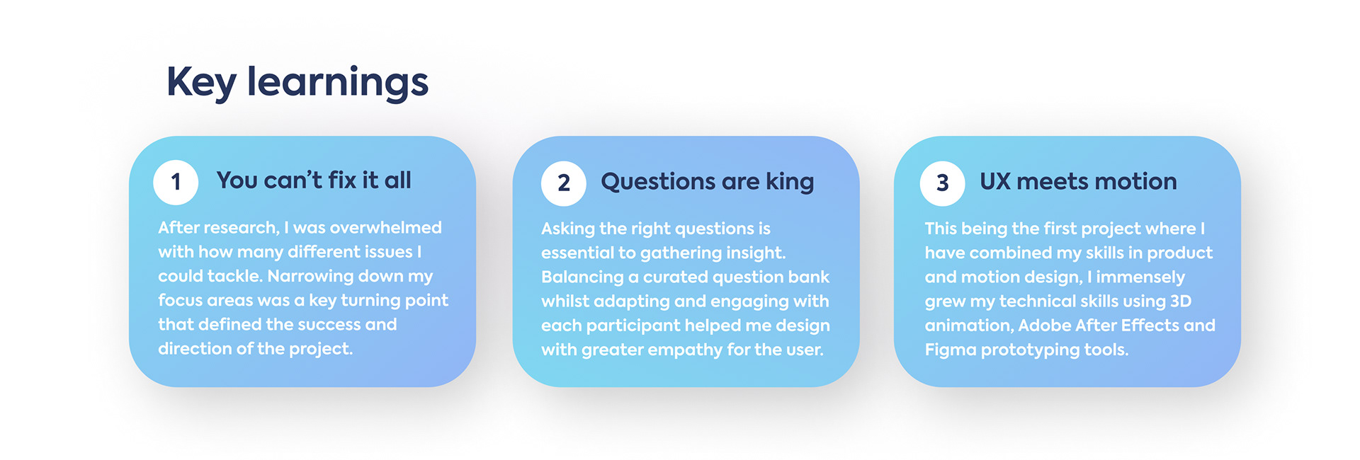
Results, impact and learnings
Overall the project was incredibly successful in both answering the brief and for personal growth. Taking just 5 weeks from concept to creation, I was amazed by how much I was able to learn and produce in this time. Key learning areas included designing for accessibility, adapting to brand guidelines, pitch-writing as well as blending UX and motion principles.
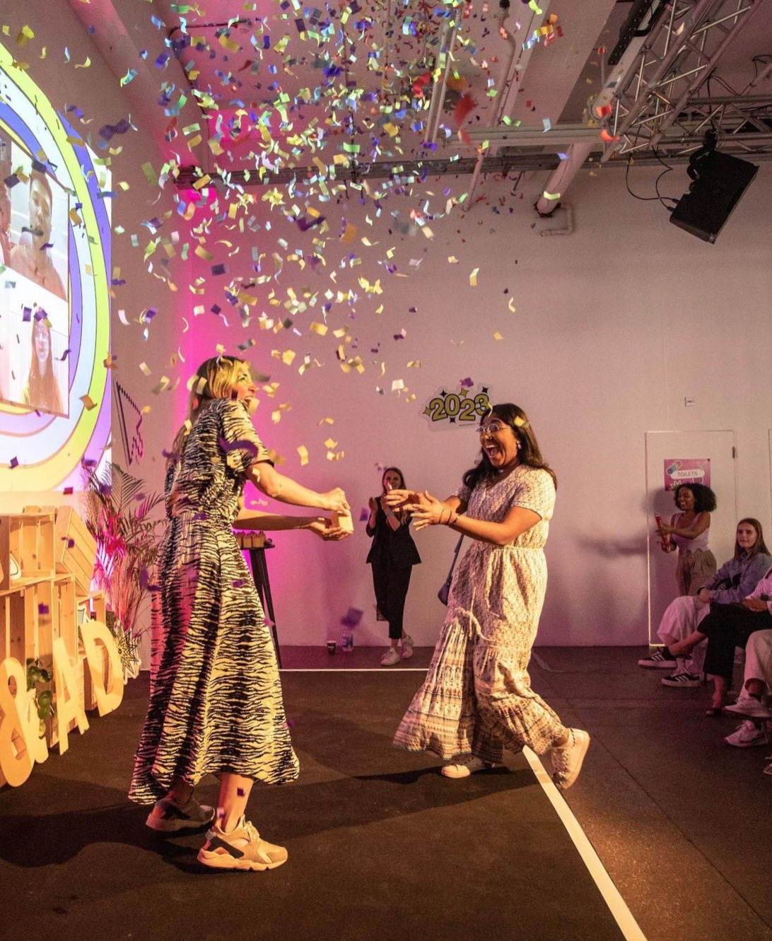
Bubble has received a widespread positive response form both industry professionals and study participants. I had the opportunity to pitch Bubble live to an audience at Barclays who are working on implementing some of the concepts in their products.
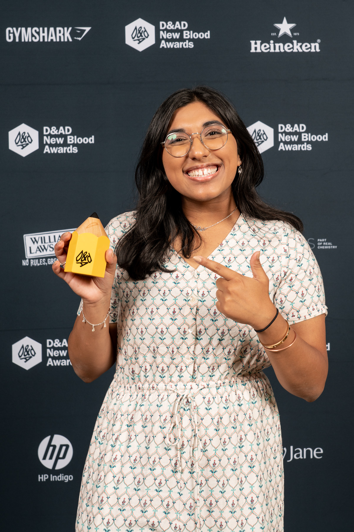
The project was selected out of 100s of global entries as a top prize winner by Barclays. I was overjoyed to receive my D&AD New Blood Yellow Pencil at the 2023 award ceremony in London!