Låtosspela - Let's Play
Modular Typography for IKEA
A conceptual new typeface inspired by the modular nature of flat-packed furniture.
Brief
Create a bespoke and original 'accent' typeface for IKEA using a modular framework inspired by their brand.
Key Skills
Typographic Theory
Adobe Illustrator
Iteration and Experimentation
Adobe Illustrator
Iteration and Experimentation

Låtosspela - "let's play"
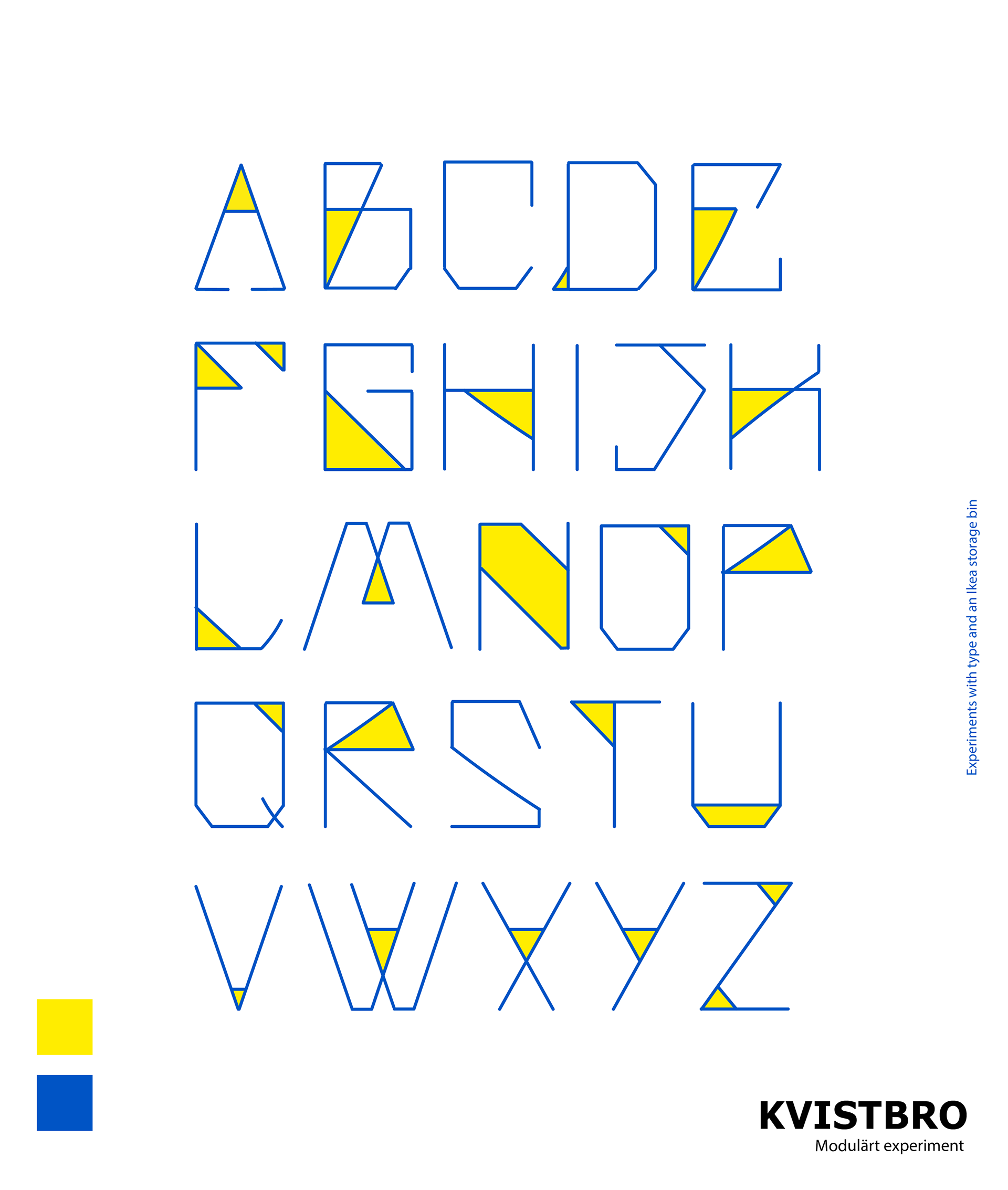
This was my first venture into typography and remains one of my favourite projects. The typeface was designed in a span of two weeks in an almost "sprint-like" manner - focusing on visual research and the iterative, experimental process of design. I enjoyed unpicking what makes letterforms identifiable, will a 'y' still look like a 'y' if the descender is out of proportion? How do you make a 'v' look different to a 'u'?
The way I see it, designing typefaces is not dissimilar to UX design - designing for a purpose and user within a proven design system - latin letterforms. It was all about bending the rules and seeing how far I could stretch each character without breaking it to the point of being unrecognisable.

Exploration
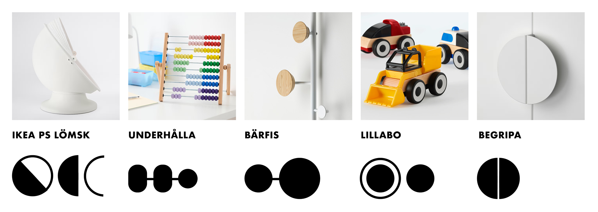
I used IKEA furniture as a starting point, extracting shapes and creating letterforms from the products. The primary outcomes didn’t embody the ‘modular’ aesthetic as much as I wanted it to.

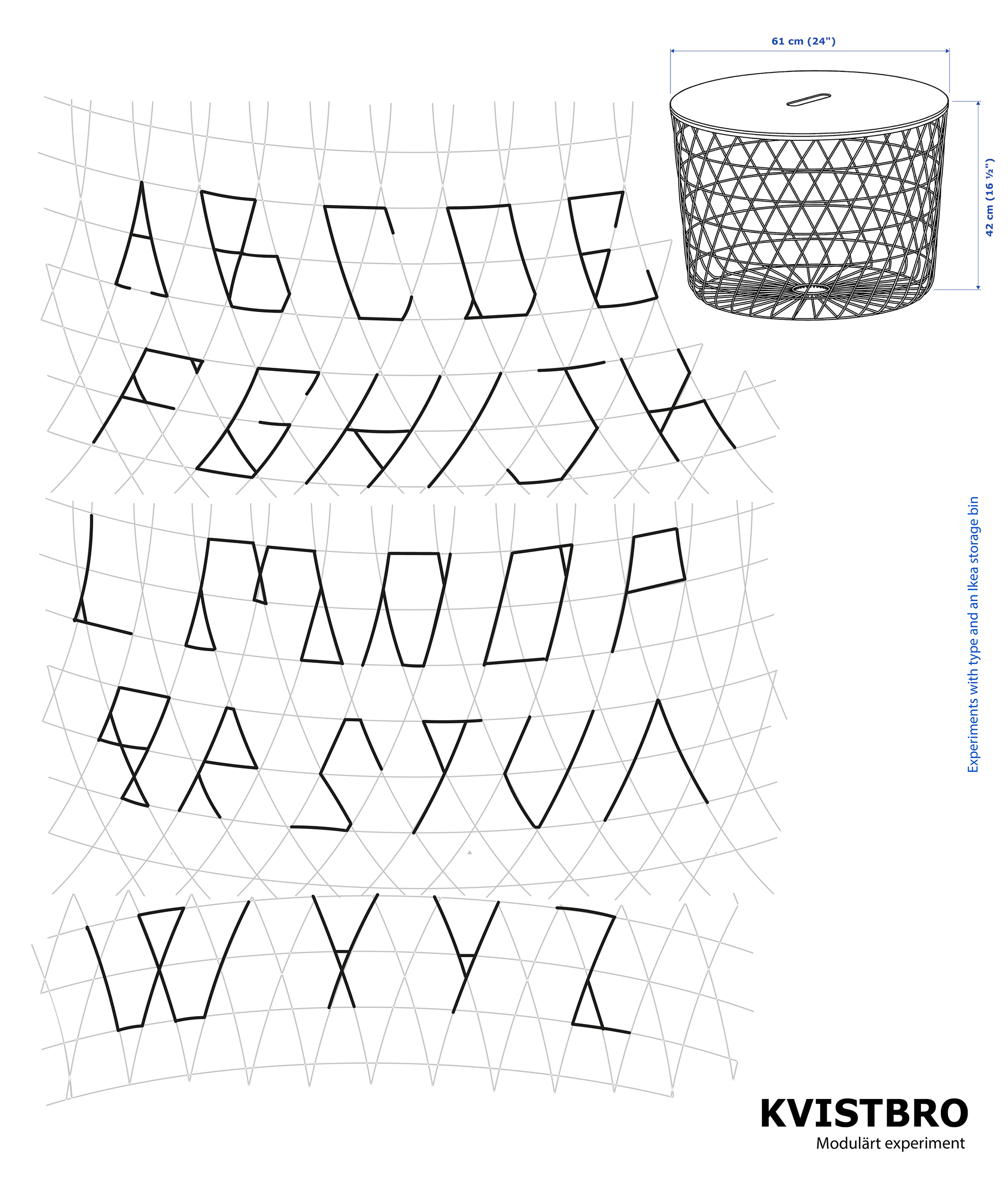
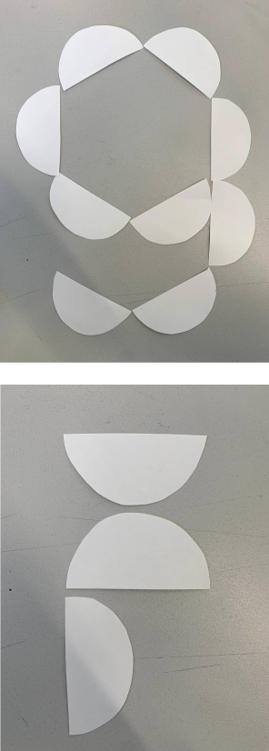
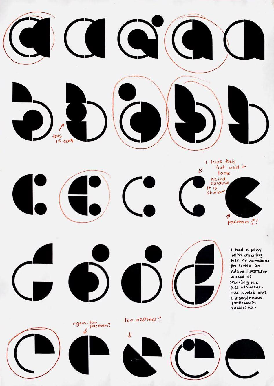
I abstracted the shapes and played with paper cut-outs until a typeface began to emerge. I experimented with possible iterations of the letterforms to select those which were the strongest.

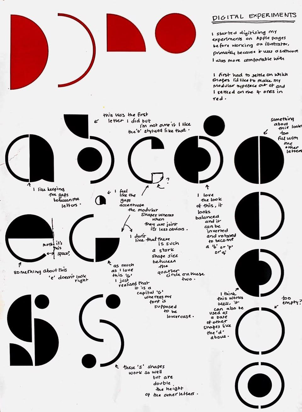
Digital Experiments
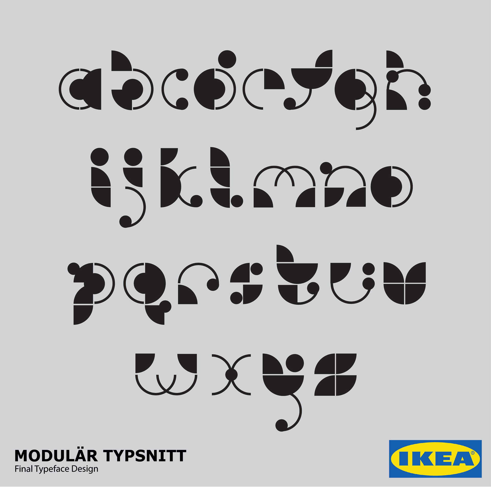
Once I narrowed down my 4 building block shapes I then took to Adobe Illustrator to refine and create the final typeface. I printed my experiments and annotated them on large A3 sheets.
Outcome
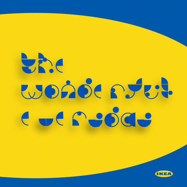
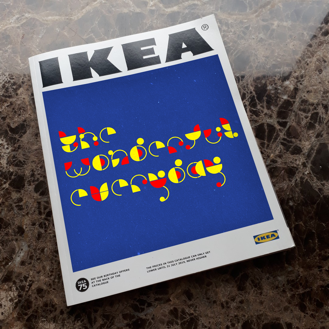
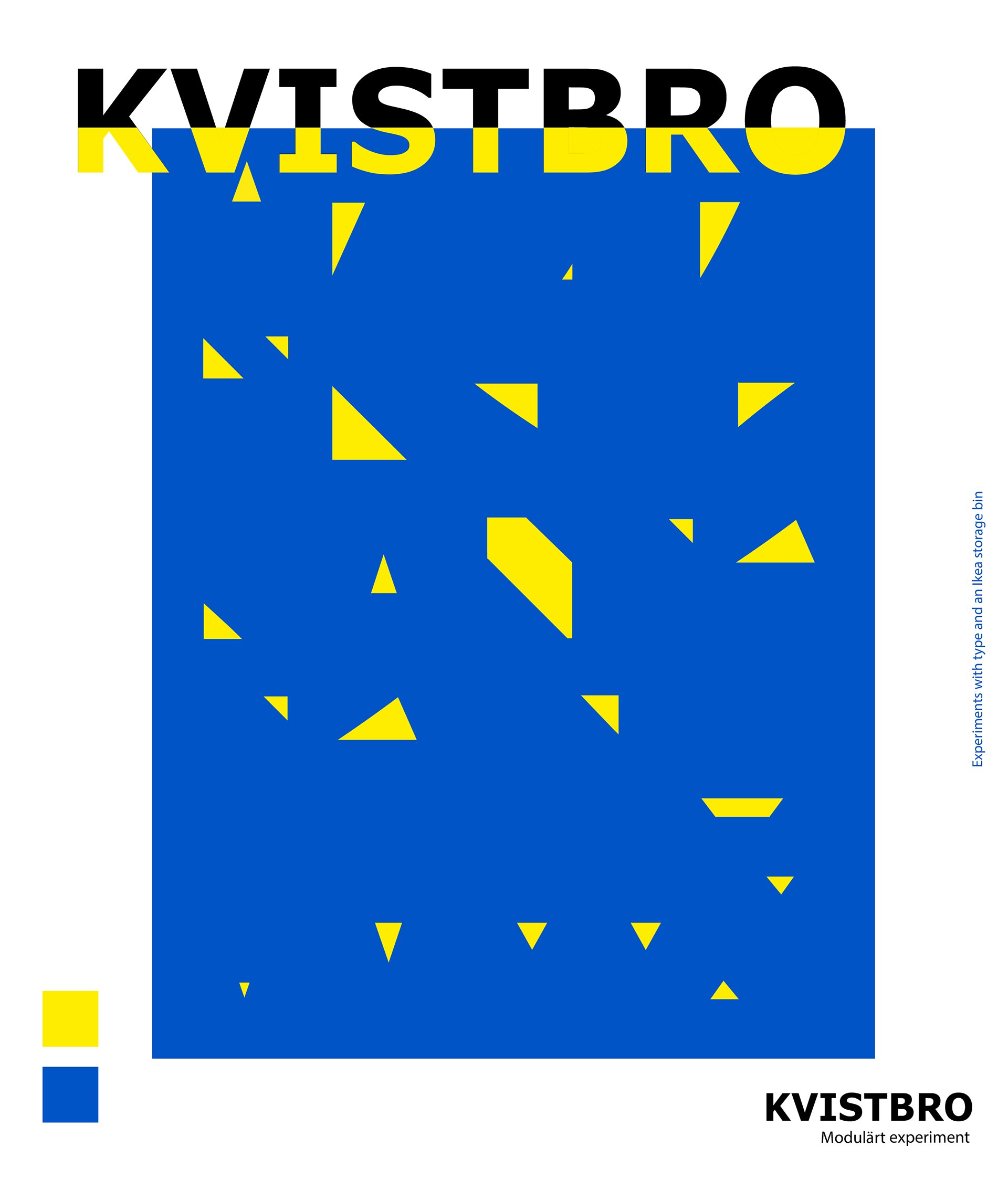
Quintessentially IKEA in its modular roots, Låtosspela is the perfect typeface for advertising campaigns and typesetting slogans such as "Welcome Home" and "The Wonderful Everyday".