Disney+ Components
Maximising Efficiency for Design Teams in Figma
I built a bespoke library of reusable components to semi-automate our team's asset production process.
Overview
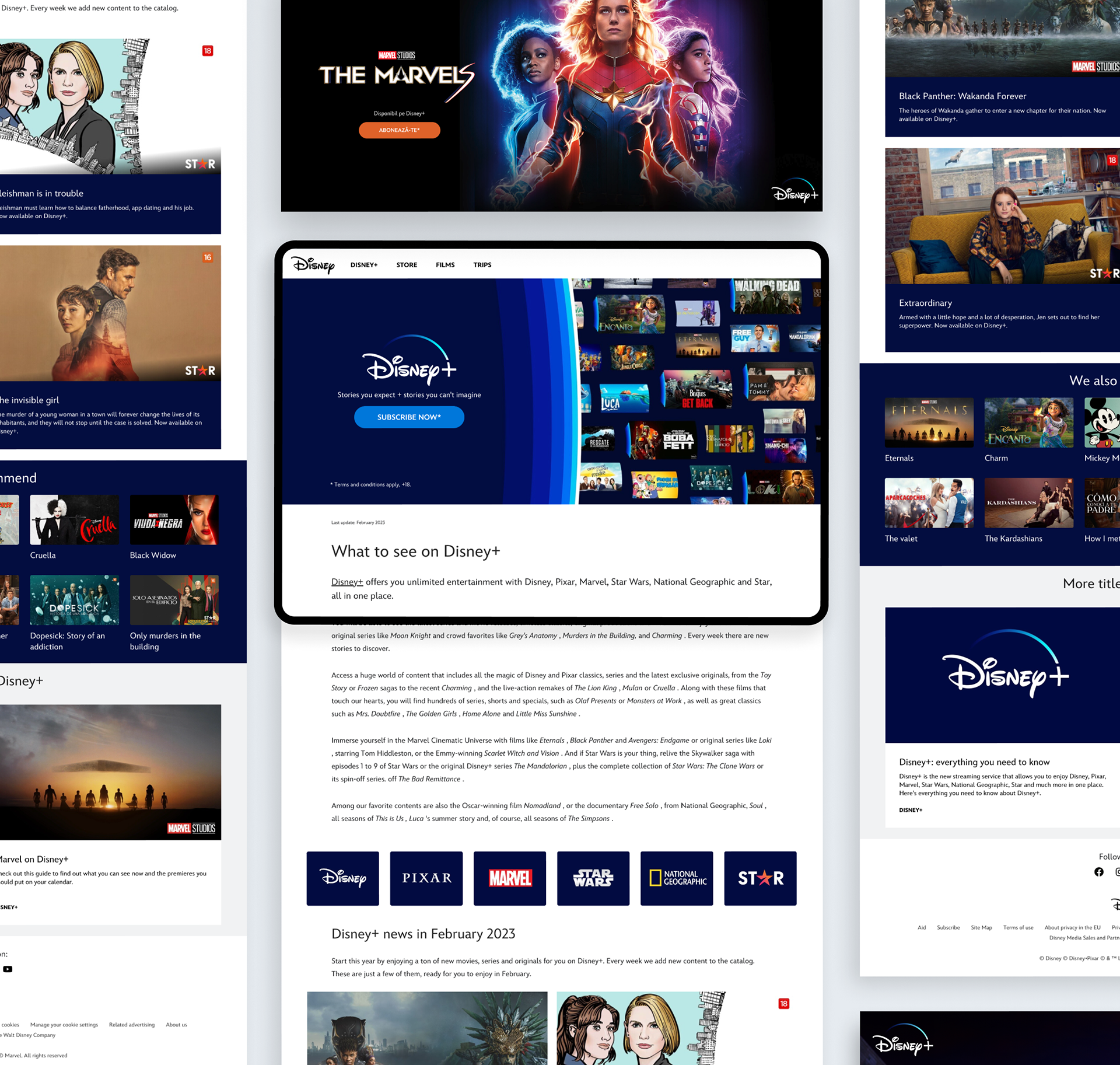
Asset production is a regular part of maintaining Disney websites across EMEA. Assets are produced for all brands in the Disney portfolio - the most complex being Disney+.
This was a self-initiated brief to simplify the way our team processed these asset design requests. The goal was to convert our existing Photoshop templates into flexible Figma components that mimicked the functionality of the live CMS.
Key Skills
Figma
Design Systems
Components / Auto Layout
CMS Guidelines
Design Systems
Components / Auto Layout
CMS Guidelines
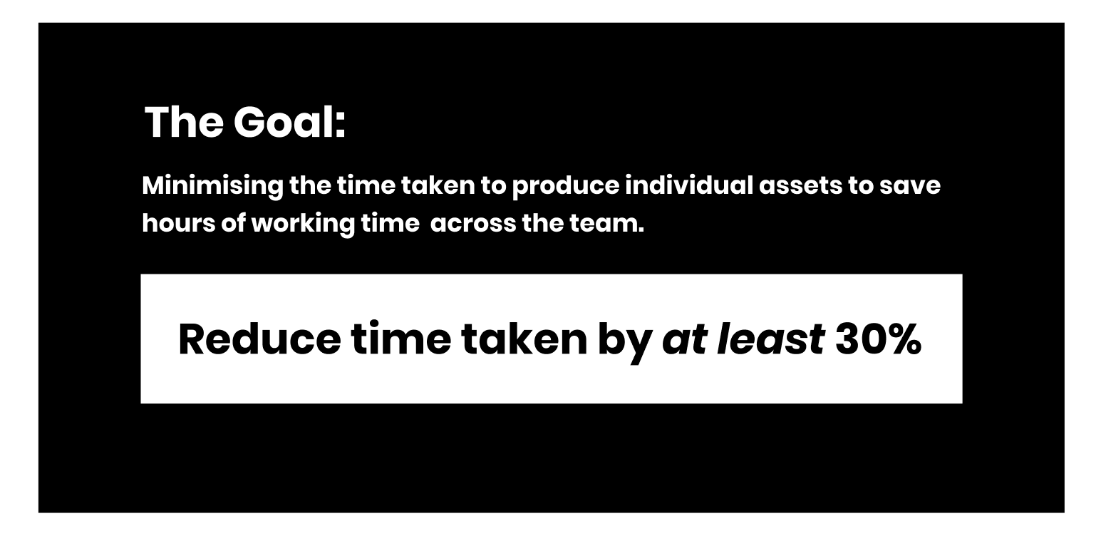
Key issues and KPI (Key Project Indicator)
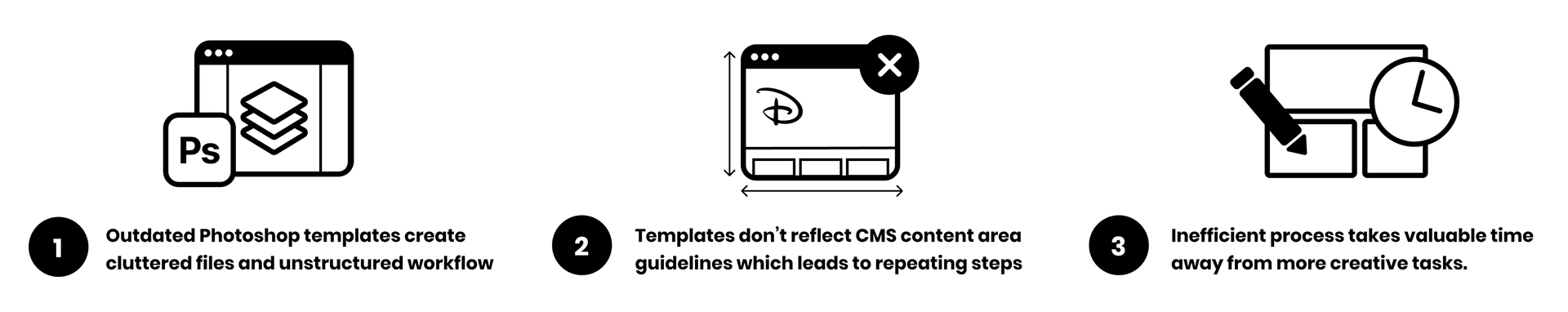
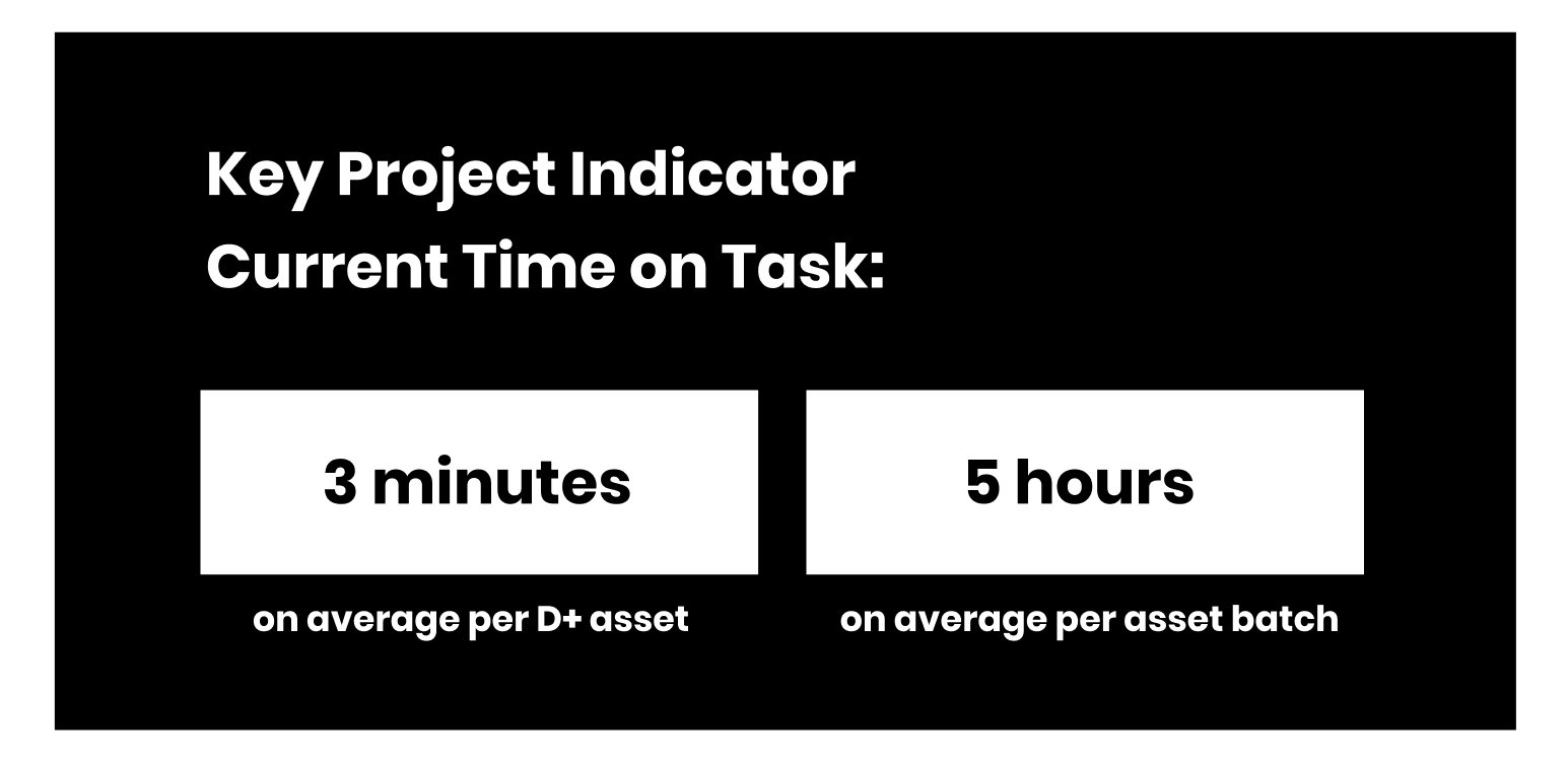
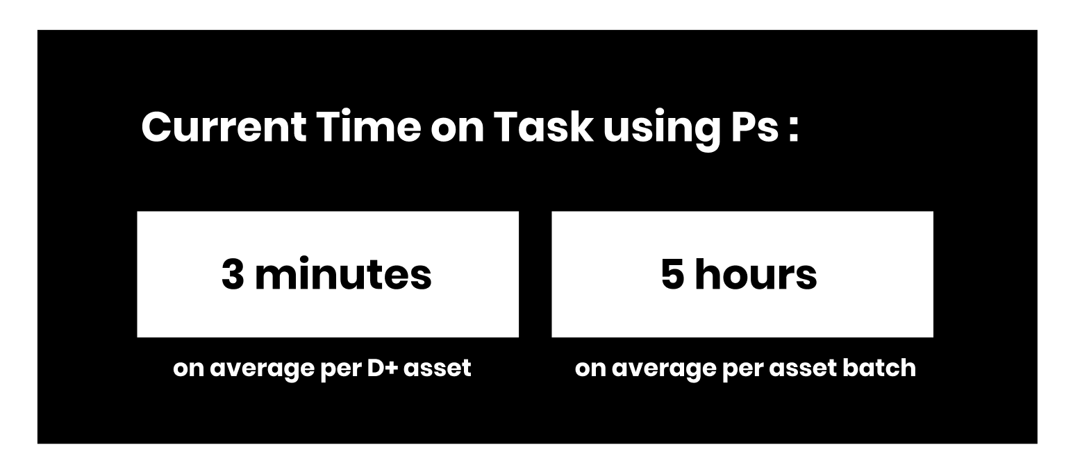
Disney+ Monthly Assets take a long time to make as they come in high volumes and require brand customisation and localised age ratings for each individual show or movie. The current Photoshop templates don't have any automation making the process heavily time-consuming.
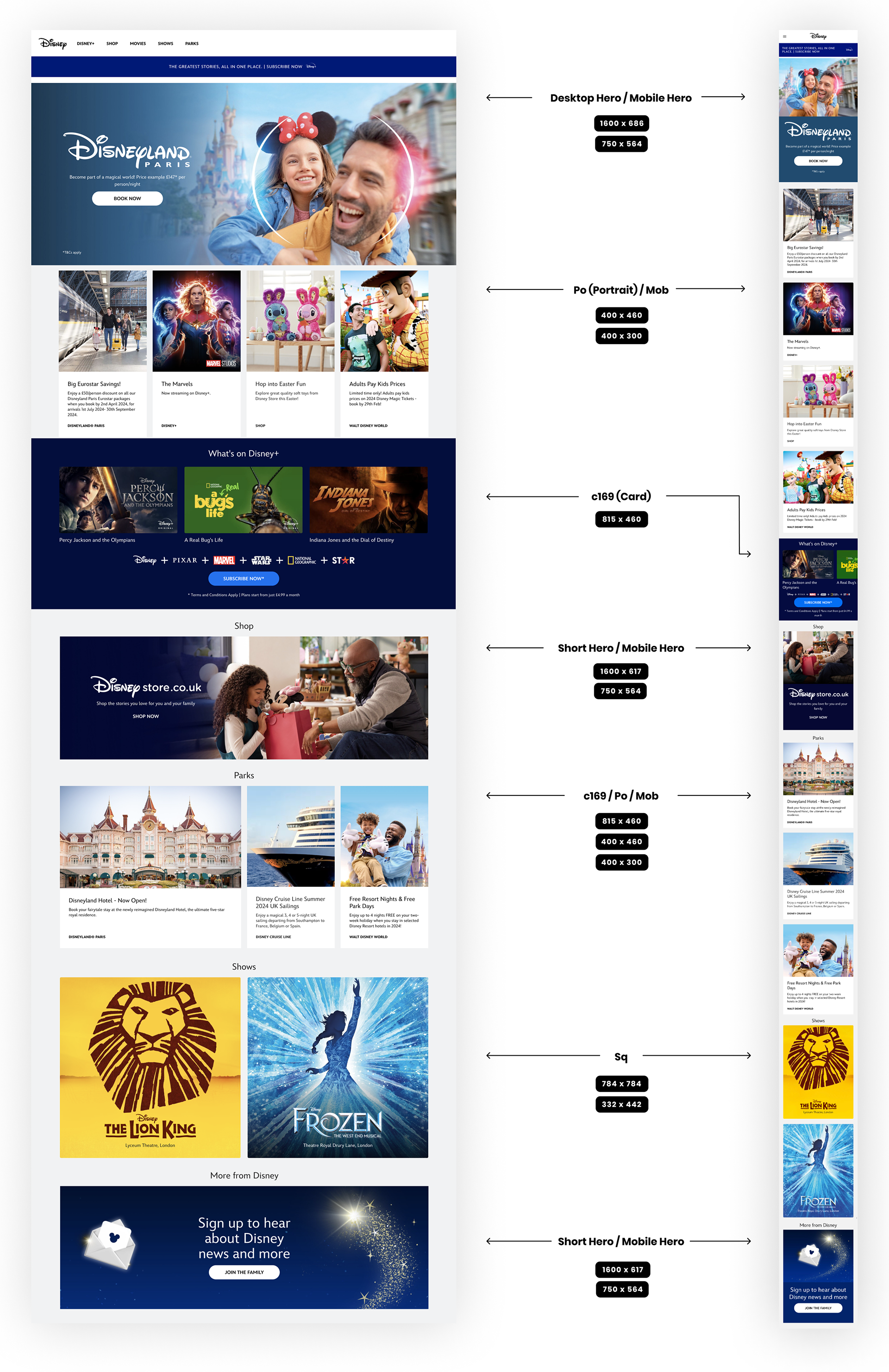
Understanding Modules - How are 'Matterhorn' sites structured?
Disney websites are hosted on the Matterhorn CMS which builds sites and pages using bespoke modules. Each module has its own dimensions and behaviours across web and mobile. Each asset promotional must correspond with its respective module:
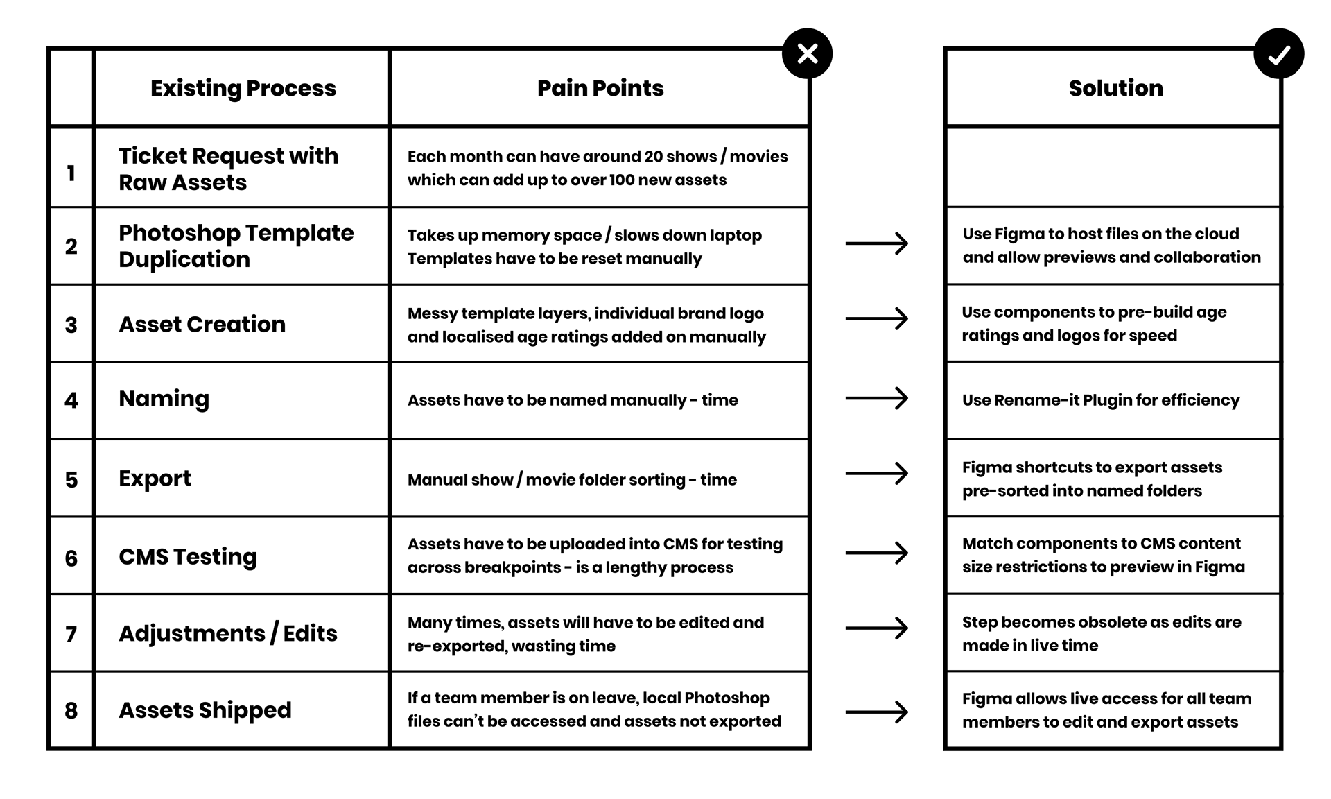
Where can make the asset design process more efficient?
I analysed each step of the current asset production process to find opportunities to cut out time. There were many advantages to migrating the process into Figma by using components:
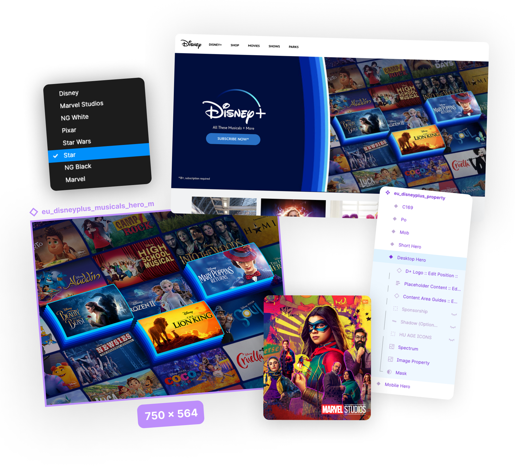
Tackling the Hero Banner
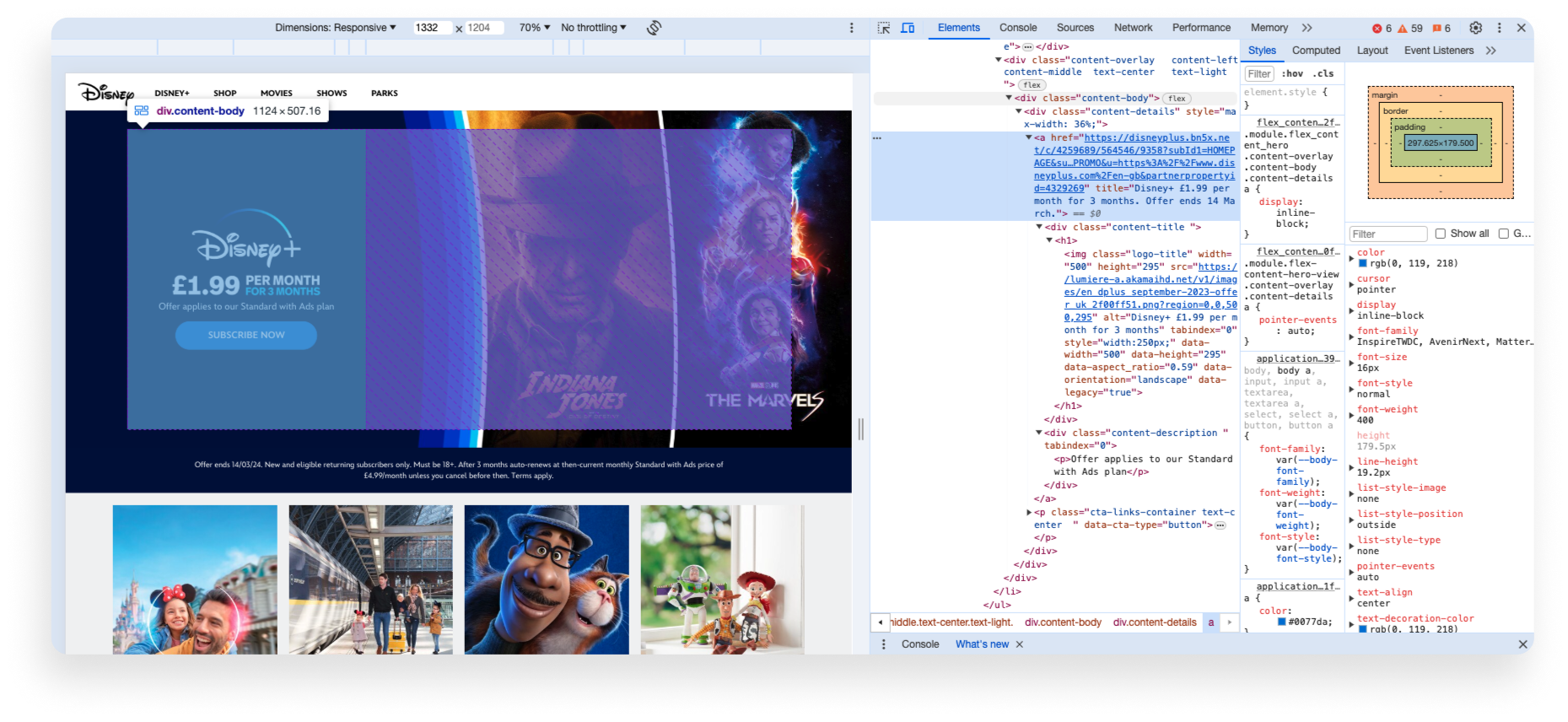
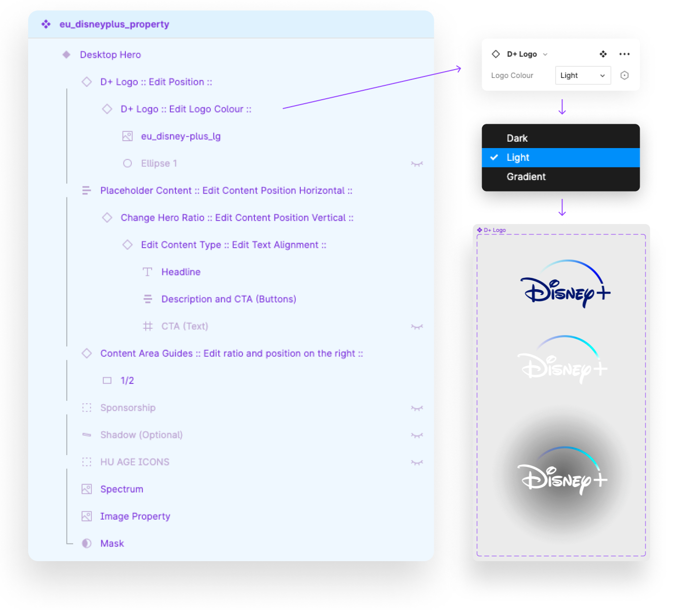
The hero banner was the most complex component to build as it had the most CMS variants for metadata eg; property logos, CTA buttons and text. The metadata could be overlayed in variety of ways. It was important to understand and tailor the module setup to suit the needs of each asset and its corresponding metadata. Previously, testing this on a CMS test page was the best way to see if the image and metadata overlapped. I wanted to eliminate this step by replicating the CMS behaviour in Figma.
The first step was to use Chrome DevTools to gather the container dimensions:
Once I understood the exact dimensions, ratios and alignment options, I replicated this using Auto-Layout and component sets:


It was important to label each layer of the component with the correct instructions so that the designer could easily identify which layer corresponds to each metadata element.
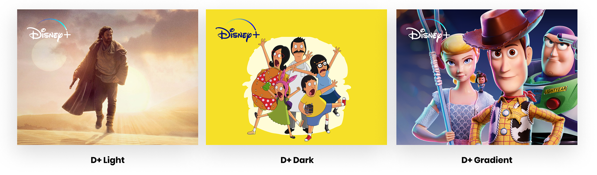
For Example, clicking on "D+ Logo :: Edit Logo Colour::" allows you to choose between 3 Disney+ Logo variants to suit your asset:
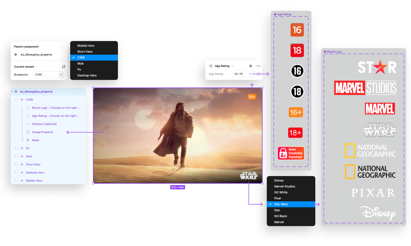
Localised Card Modules
c169 modules and their corresponding mobile assets are the 2nd most time-consuming asset to produce. Different EMEA market regulations require age ratings to be displayed on promo assets.
With the range of IP available on D+ assets must also include the corresponding brand logo.
Eg; the asset below: "eu_obi-wan-kenobi_star-c169_r" has an EU age rating sticker and Star Wars logo.
Using Auto Layout and component sets allowed me to build the ratings and logo variants into each asset. On Photoshop, these layers had to be turned on and off manually - now they can be easily selected via a dropdown menu.
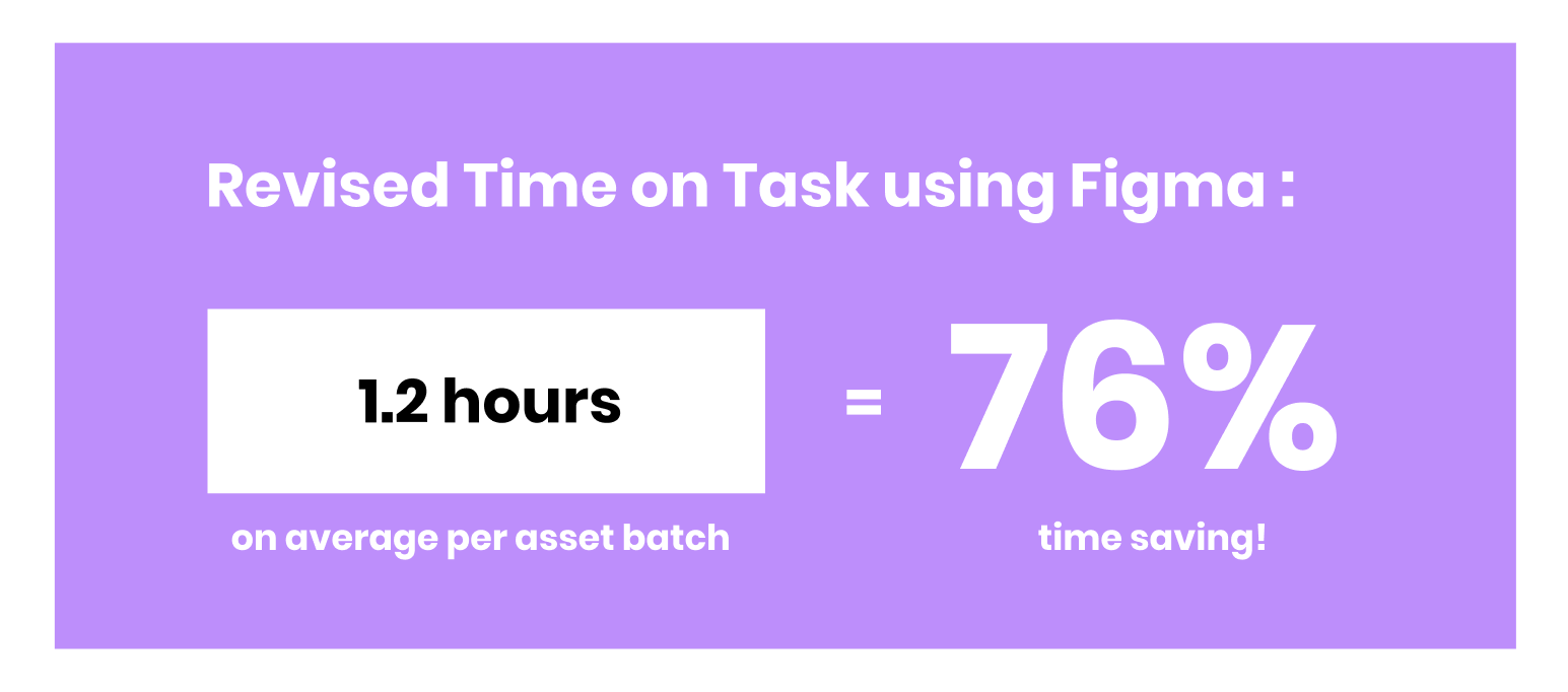
Results and impact
It took 2 months to build the complete component library replicating the Matterhorn modules. During the process I sought help from producers who are CMS Experts and our own Prism design systems team, who help me utilise component sets and Auto Layout to maximise efficiency.
Ultimately, a new asset production process was built around the component library, and the new, collaborative system dramatically reduced our time spent producing these assets by an average of 75%. With the extra time, our team was able to output the assets faster, with less errors and revisions as well as dedicate valuable hours to projects which required greater attention.

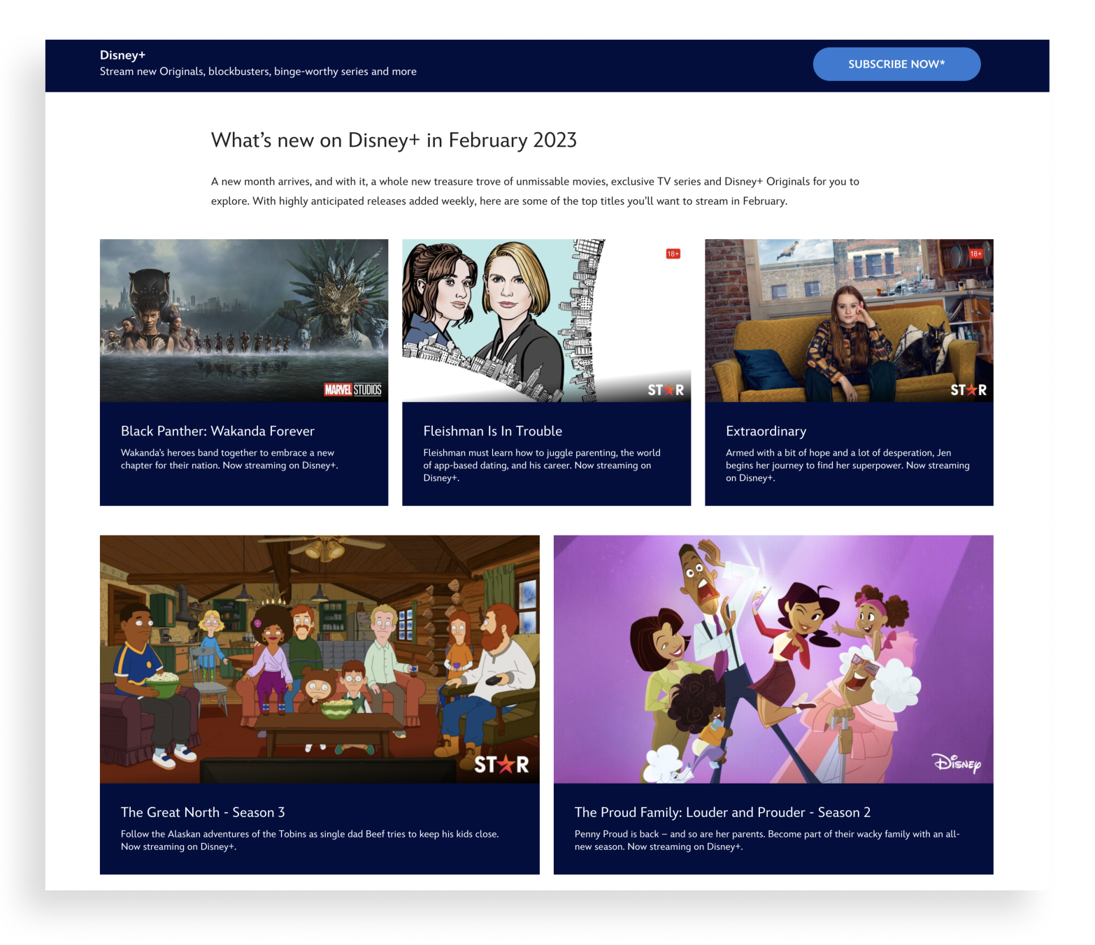
Sample of asset variants produced using the new, efficient process and Figma components